Why Complementary Colors Change the Way Makeup Reads
Complementary colors in makeup can shape contrast without dictating a palette. Learn how hue, placement, and intensity affect the way a pairing reads.
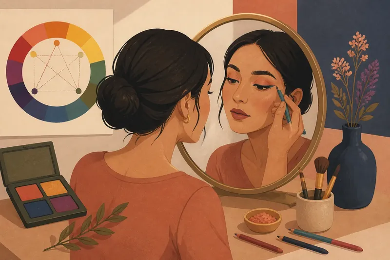
Complementary colors in makeup can make one shade stand apart from another, but the effect depends on the exact hues, their intensity, and where you place them. A copper shadow beside a cool blue liner may create a noticeable contrast; muted versions, or shades separated by other colors, may read more quietly.
On a color wheel, complementary hues sit across from each other. Blue and orange are a familiar pair, as are red and green and yellow and violet. Makeup shades are rarely pure versions of those colors, so the wheel is best used as a starting point rather than a promise about how a look will appear.
What does “opposite” mean in makeup?
A color wheel arranges hues by their relationships. Colors across the wheel are called complementary because they differ in hue. In a simplified wheel, blue faces orange, red faces green, and yellow faces violet.
Cosmetic shades are rarely pure wheel colors. A lipstick may be a muted berry rather than a clear red; an eyeshadow may lean gray, brown, or pink. Those undertones affect how a shade relates to a possible complement. The strength of the contrast also depends on how bright, dark, or vivid the two products appear beside each other.
Complementary does not mean “best” or “most flattering.” It names a color relationship, not a rule about which shades belong on a particular person.
How can complementary colors affect contrast?
When contrasting hues sit near each other, each may look more distinct, though the result varies with the shades and their placement. A warm peach blush beside a cooler plum detail, for example, may make their warm-cool difference easier to notice. A colored liner beside an eyeshadow from the opposite side of the wheel may also read as an accent, especially if the shades differ in brightness or vividness.
Value means how light or dark a shade appears; saturation means how vivid it looks. A bright orange beside a deep blue differs in hue, value, and intensity. A pale apricot beside a smoky navy also contrasts, but its softer shades may make the effect feel less forceful.
Compare shades in lighting similar to the light where you expect to wear them. A color that looks vivid under a bright vanity light may appear quieter in a dim room.
Which complementary pairs can work around the eyes?
Eyeshadow and liner offer a small area for trying color relationships. Choose a pairing based on the shade you want to emphasize, rather than relying on a fixed chart of eye colors.
- Blue and orange: A warm bronze or copper accent may contrast with blue shadow or liner. If the pairing looks too forceful, try muted terracotta or peach; if it still feels too vivid, use the warm shade in a smaller area.
- Red and green: A soft red-brown shadow may contrast with sage or olive liner. If the colors look costume-like together, shift one toward brown or gray; if they still compete, keep one as a narrow accent and use a neutral on the rest of the lid.
- Yellow and violet: A lilac accent may make a golden or yellow-toned shadow look more distinct. If the difference feels too sharp, choose dusty violet or soft gold; if the colors seem to disappear, try a clearer version of one shade without increasing both at once.
Say you have a muted olive liner and want it to show without covering the lid. You choose a soft rose-brown shadow, apply it across the lid, then draw a narrow olive line near the lashes. The expected result is a restrained warm-cool contrast; if the liner blends into the shadow, a clearer olive shade or a lighter shadow would make the edge easier to see.
How can you use the relationship without matching a wheel?
Start with the shade you want to feature, then treat its opposite as one possible accent. If you want a plum lipstick to remain the focus, a small touch of yellow-gold on the eyelid may add contrast without spreading another strong color across the face. If you want a teal liner to stand out, a peach-toned shadow may provide a warm counterpoint.
Placement changes the result. Opposite hues blended together may look muddy, especially when both are opaque. Keeping them in separate zones, such as a colored liner beside a neutral shadow, can help preserve their individual appearance. A sheer wash or small accent may make the pairing feel less graphic.
Consider the whole face, too. A warm blush, cool lip, and contrasting eye accent may each work alone but feel crowded together. If that happens, leave one feature quieter.
What can you change if the colors feel too strong?
Reduce one part of the contrast rather than abandoning the pairing. Choose a less vivid version of one hue, shift a shade toward brown or gray, or apply the contrasting color in a smaller area. A soft blue-gray liner, for instance, may feel less graphic beside warm peach shadow than a vivid cobalt.
You can also keep the colors apart. Place the warmer shade on the lid and use the cooler tone as a narrow line near the lashes. This lets the colors remain visible without turning the whole eye into a two-color block.
If a combination feels harsh, consider whether value or saturation is the issue rather than hue. Two vivid shades may compete even when their hues sit opposite each other on the wheel. Softening either shade may make the pairing feel more balanced.
How do you choose a complementary makeup pairing?
- Check the focal shade: If one color should draw attention, start with it and make the opposite hue optional; if neither is meant to dominate, choose a neutral base and test a small accent.
- Check the vividness: If both shades look strong, soften one or use it in a smaller area; if one already looks muted, keep the clearer shade restrained until you see them together.
- Check the lightness: If the shades differ greatly in lightness, expect a more graphic contrast and consider a middle-value shade; if they look similar in lightness, use placement to keep them distinct.
- Check the blend: If blending makes the colors look dull, separate them into different areas; if they remain clear when blended, a soft transition may suit the look.
- Check the rest of the face: If several features already carry strong color, quiet one of them; if the overall look still feels balanced, keep the accent as planned.
- Check the lighting: If the pairing looks different under your usual indoor light, adjust the shade or placement there; if it remains clear, use the same arrangement for the finished look.
Imagine you want a teal liner to remain the focus and have peach and navy shadows available; these are invented shade choices, not product claims. First, you place small swatches of all three on a clean surface, then compare them under the room light where you plan to wear the makeup. Next, you apply peach as a light lid wash and draw a narrow teal line, leaving navy aside. If teal stands apart without making the eye feel crowded, you keep that arrangement; if it looks too sharp, you soften the peach or reduce the liner area, and if it blends into the peach, you try the navy only as a small, separate accent. The resulting choice is a restrained teal-and-peach contrast, with navy omitted unless it adds a distinct role.
Does complementary color need to follow skin tone?
Skin tone can affect how makeup shades appear, but it does not assign anyone one correct complementary palette. A product may look warmer, cooler, brighter, or more muted against different complexions and nearby colors. Looking at the actual shades together is more useful than treating the color wheel as a personal-color verdict.
Compare the shades on the face or on a clean surface near the makeup area. If the contrast is too sharp, try a softer version; if it disappears, choose a clearer or more distinct accent. The aim is to control what catches the eye, not to pass a color-matching test.
What do readers often ask about complementary makeup colors?
Do complementary colors have to be worn together?
No. The wheel describes a possible contrast, not a required combination. Use it to choose an accent, or set it aside when another palette better suits the look.
Does opposite-colored makeup make eye color stand out?
It may create contrast near the eyes, but the result also depends on value, intensity, and placement. Try a small accent beside a neutral shade before building the contrast across the lid.
Can complementary colors be blended together?
They can, but the mixture may look dull or brownish because the hues counterbalance each other. Keep them in separate areas if you want both colors to remain distinct.
Is a neutral shade part of a complementary look?
Yes. Brown, taupe, gray, and cream can give a contrasting accent room to show without adding another vivid color. A neutral can also soften the edge between stronger shades.
Complementary colors in makeup are a way to think about contrast, not a formula for a finished face. Start with the shade you enjoy, then decide whether its opposite should appear boldly, quietly, or not at all. The phrase complementary colors in makeup is most useful when it leads you to compare actual shades in your own lighting before settling on their placement.